






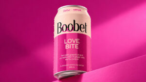






















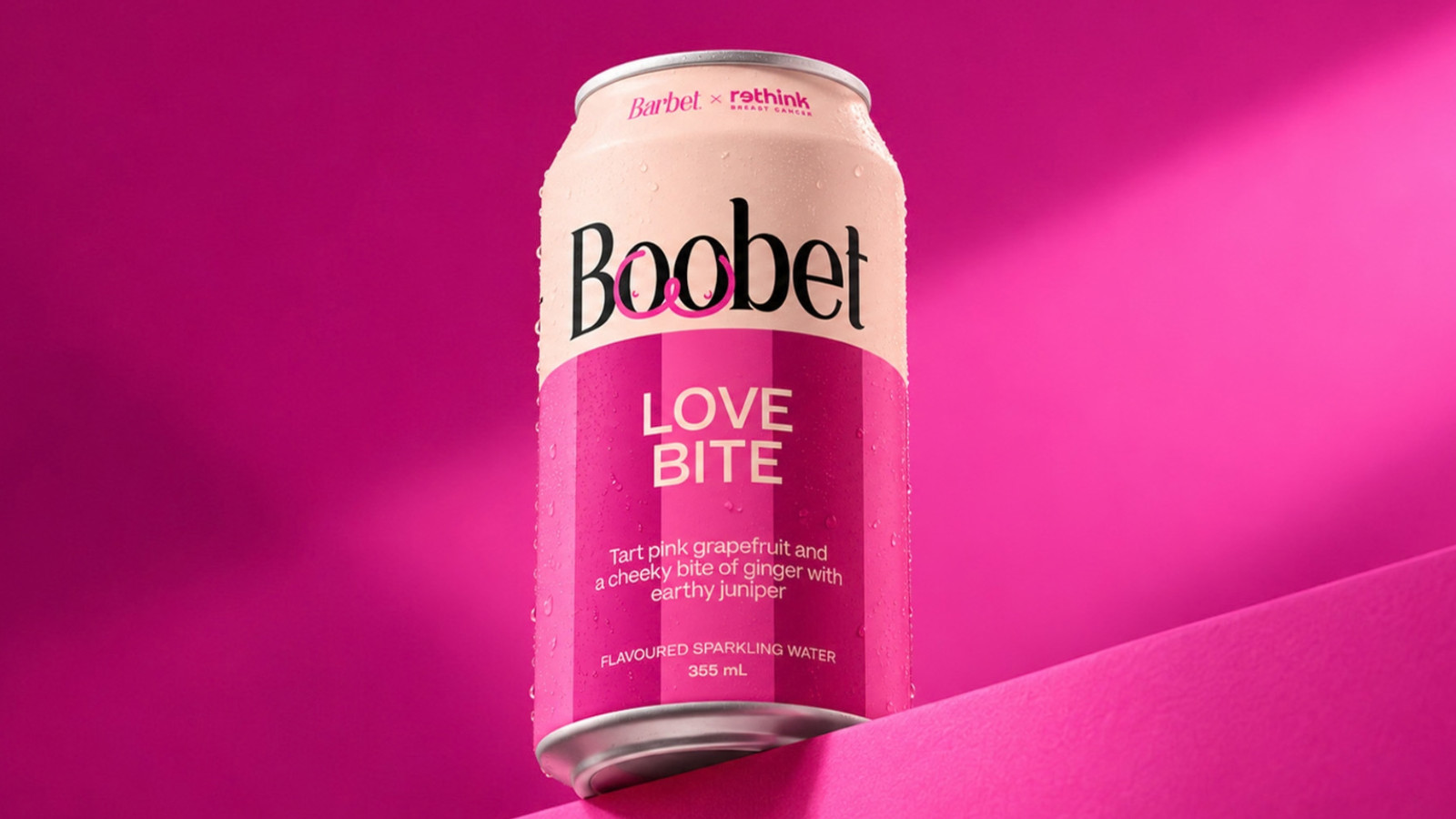
A beverage can is an unlikely place to start a conversation about breast health, but Barbet found a way to make it work by changing just two letters. For Rethink Breast Cancer’s 25th anniversary, the Canadian sparkling beverage brand became ‘Boobet’, turning its familiar Love Bite can into a playful reminder of breast health. Created with creative agency No Fixed Address, the limited-edition design uses humour and distinctive packaging to make an important message harder to overlook.

The collaboration is part of Rethink Breast Cancer’s ‘25 for 25 Collection’, which brings together 25 Canadian brands to celebrate the organisation’s anniversary. Rather than keeping the milestone within a traditional awareness campaign, Rethink invited brands to create limited-edition products that could carry its message into people’s everyday lives. The collection also reflects the organisation’s approach to breast cancer awareness, which makes space for diverse bodies, personal experiences and conversations that can sometimes feel uncomfortable.
For Barbet, the most noticeable part of its packaging offered the simplest creative opportunity: its own name. No Fixed Address changed two letters to create ‘Boobet’, a cheeky wordplay that immediately connects the drink to the campaign’s focus. The can features Rethink’s hand-drawn breast illustrations, developed for the organisation’s 25th anniversary identity and inspired by the diverse bodies, scars and stories of its community. Together, the name and illustrations give the packaging a distinctive look while keeping breast health at the centre of the idea.
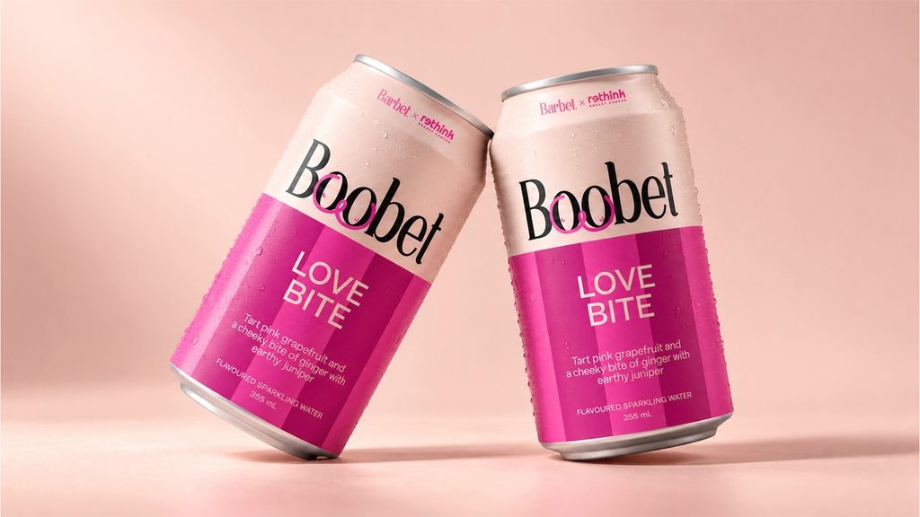
The name change also gives the partnership a personal dimension. Companies carefully build their brand identities, and changing a name, even temporarily, is not an everyday decision. Barbet’s co-founder and CEO, Andrea Grand, explained that lending the brand name to the cause was an easy choice if it could encourage someone to book a screening or check in with a friend. The decision allowed Barbet to contribute its most recognisable asset to the campaign rather than simply placing a charity logo on an existing product.
The limited-edition can retains Barbet’s Love Bite flavour, a sparkling beverage featuring pink grapefruit, ginger and juniper. Its contents remain familiar, but the packaging gives consumers a new reason to pause and look. The unusual name can spark curiosity, while the illustrations make the breast health connection clear. Rethink’s official collection information states that 100% of the proceeds from the custom Boobet cans support the organisation, linking the creative idea to direct financial support.
The collaboration also formed part of a wider public activation during Breast Cancer Awareness Month. The ‘25 for 25 Collection’ became available online through participating retail partners from October 1, 2026, with the Rethink House pop-up opening in Toronto the following day and running until October 31. Visitors could explore the collection and engage with Rethink’s work in a physical space designed to bring the anniversary to life. This gave the individual brand collaborations a shared destination, connecting limited-edition products with community engagement and awareness.

‘Boobet’ makes breast health awareness part of an ordinary purchase in a way that feels unexpected but easy to understand. The name catches the eye, the hand-drawn illustrations connect the can to Rethink’s mission, and the proceeds give the partnership a practical purpose. By turning two small changes to its name into a larger conversation, Barbet shows how packaging can do more than identify a product. It can invite people to look again, talk openly and take a meaningful step towards caring for their health.
Want to stay updated on the latest campaigns and creative ideas? Follow Markedium Campaigns for more.
Have a campaign you think deserves a closer look? Submit it to us here.













Leave a comment