

























Michelangelo spent years shaping marble into masterpieces. Centuries later, his handwriting is getting a creative makeover, and this time, the result is something you can use in Microsoft Word.
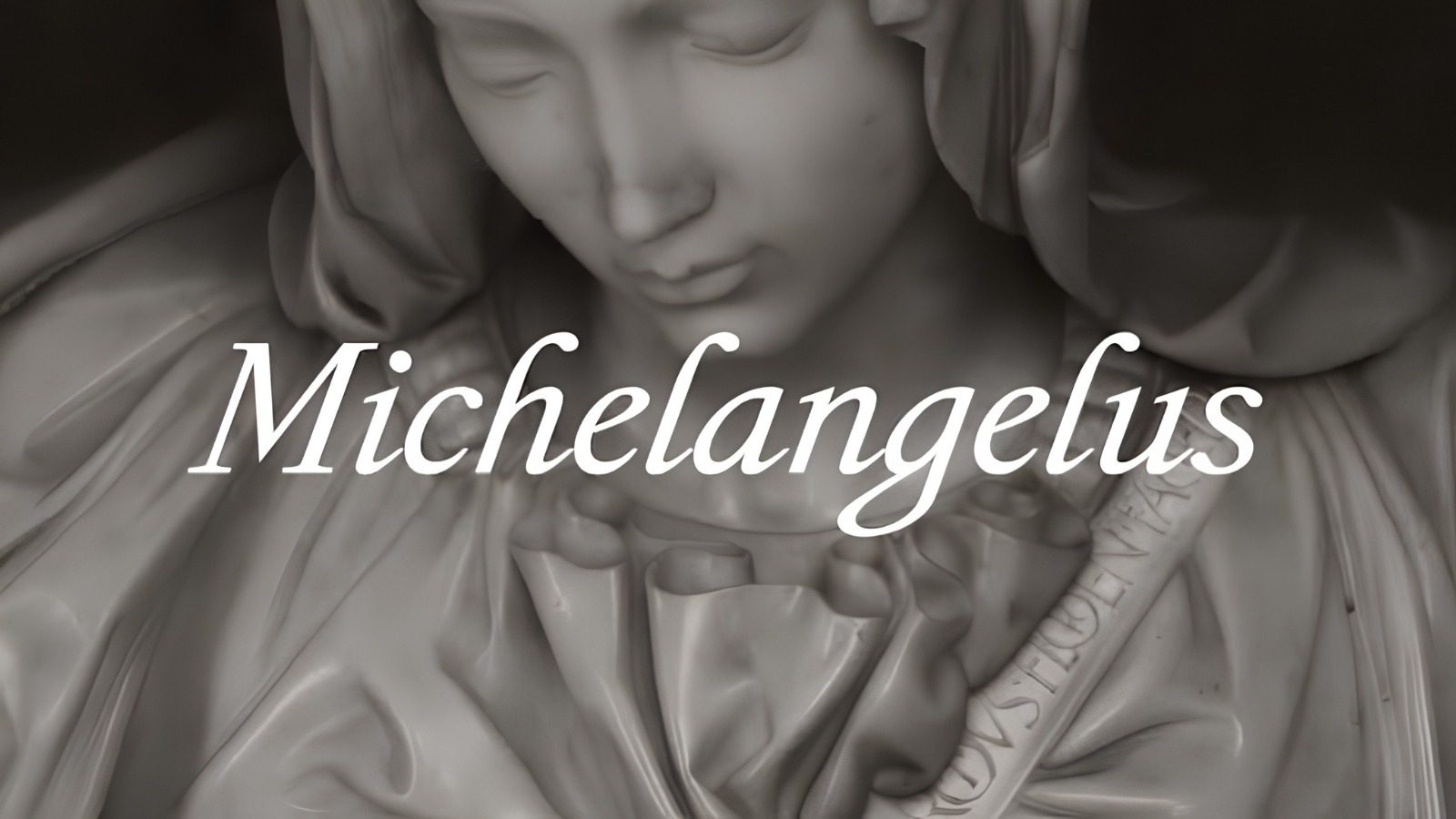
Microsoft has introduced Michelangelus, a typeface inspired by the original handwriting of Renaissance artist Michelangelo Buonarroti. Developed by Italian design agency Studiogusto for the Fabbrica di San Pietro, the institution responsible for maintaining St. Peter’s Basilica in Vatican City, the font transforms the artist’s handwritten letters and notes into a contemporary typographic system. The project commemorates the 400th anniversary of the consecration of St. Peter’s Basilica, connecting one of history’s most recognisable artistic legacies with the digital tools people use today.

The idea is particularly interesting because the team did not set out to produce another decorative handwriting font. Instead, the challenge was to understand how Michelangelo’s writing worked and translate its distinctive qualities into something that could function beyond the pages of historical manuscripts. That meant looking past the appearance of individual letters to examine their proportions, spacing, rhythm and structure.
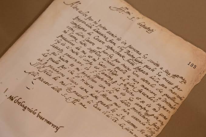
To develop Michelangelus, Studiogusto studied original manuscripts preserved in the Vatican archives, examining the artist’s letters, notes and signatures. The research revealed a visual system beneath the handwriting, shaped by the artist’s precision and architectural sensibilities. His letters were not simply flowing marks made by a quill. They followed an underlying order, with deliberate spacing and distinct forms that contributed to their readability.
That attention to clarity is particularly fitting for an artist whose own correspondence suggests he had little patience for illegible writing. In a letter to his nephew Lionardo, Michelangelo complained about struggling to read his handwriting and urged him to write more carefully. The anecdote offers an unexpected insight into the project: for Michelangelo, beautiful writing was not enough if the reader could not understand it.

The design team carried that principle into the new typeface. Rather than reproducing every handwritten irregularity, the designers interpreted the qualities that gave Michelangelo’s writing its character while ensuring the final product remained legible and usable. Some letterforms retain recognisable details from his handwriting, while others were developed through a broader study of his artistic and architectural work.
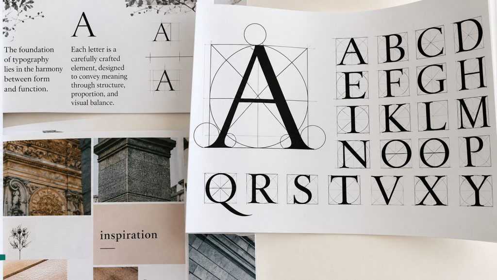
The process also involved a few creative workarounds. The team could not find a complete set of Michelangelo’s handwritten numbers, so the designers had to develop modern numerals using existing letterforms as references. The uppercase alphabet required a different approach, drawing inspiration from monumental inscriptions and architectural details associated with the artist, including the inscription on his Pietà sculpture and lettering found at St. Peter’s Basilica.
The result is Michelangelus, a typeface comprising more than 500 glyphs across four styles: regular, italic, bold and bold italic. Designed to work across printed materials, digital communication and signage, it gives the historical inspiration a practical purpose beyond the anniversary that prompted its creation.
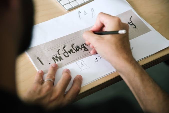
Microsoft’s involvement takes the project a step further by making the typeface accessible to a much wider audience. Commissioned by the Fabbrica di San Pietro and developed by Studiogusto in collaboration with Microsoft, Michelangelus is available as a free download and is set to join the Microsoft 365 font collection. This means an artistic legacy traditionally encountered through museums, monuments and archival documents can also find its way into everyday presentations, documents and other digital materials.

For the Fabbrica di San Pietro, the project is part of a broader effort to preserve cultural heritage while finding contemporary ways to share it. Rather than keeping Michelangelo’s handwriting confined to the archives, the collaboration turns it into a living part of modern communication. The approach also demonstrates how design can serve as a bridge between historical preservation and technological accessibility, without requiring the original work to lose its identity in the process.
Michelangelus does not attempt to make every document look like a page from the Renaissance. Instead, it takes the principles behind an artist’s handwriting and adapts them for a world of screens, keyboards and digital publishing. In doing so, Microsoft and Studiogusto have found a way to give an old creative practice a new audience.
Michelangelo may have built his reputation on stone, paint and monumental architecture, but his handwriting has now found another medium. And for once, getting a little piece of Renaissance history into your next document will require less chiselling and considerably fewer tools.
Want to stay updated on the latest campaigns and creative ideas? Follow Markedium Campaigns for more.
Have a campaign you think deserves a closer look? Submit it to us here












Leave a comment