

























The new identity brings McLaren’s racing and automotive businesses closer together, but its quieter luxury aesthetic has sparked questions about whether the brand has softened its racing edge.
McLaren has returned to its roots in its latest brand identity, honoring the history of founder Bruce McLaren while preparing for a broader future across racing, road cars, and customer experiences.
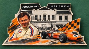
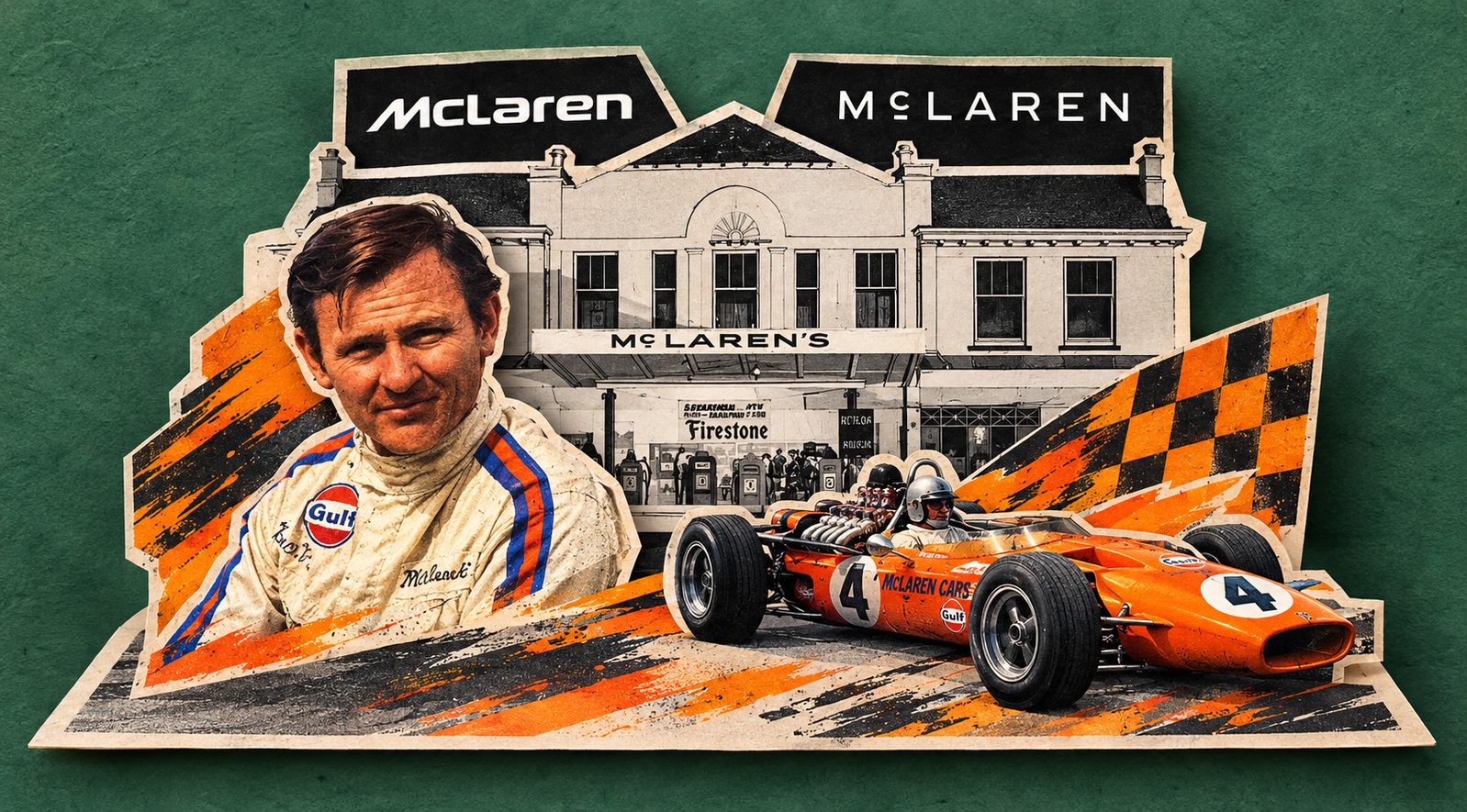
Unveiled in September, the evolved identity brings McLaren Racing and McLaren Automotive under a more connected visual system. At its center is a new wordmark inspired by the sign that once stood above the McLaren family service station in Remuera, Auckland, where Bruce McLaren built the car that would take him to his first racing victory.
The new wordmark uses a lighter sans-serif style than the previous version, with a horizontal line below the “C” as a reference to the original signage. McLaren has also developed a dedicated typeface called “McLaren Sans” to give the brand a more consistent visual language across its corporate businesses.
The move, however, is more than a change of lettering. McLaren has also introduced an expanded color palette while retaining familiar elements such as Papaya, Speedmark, and Speedy Kiwi. The company says the aim is to create a clearer expression of the brand as it expands its community, experiences, and personalization.
That heritage connection gives the redesign a convincing starting point. Instead of creating a completely unfamiliar symbol, McLaren has found something from its own history and brought it into a contemporary setting.
But whether the new look feels unmistakably McLaren is a more complicated question.
McLaren’s new wordmark draws inspiration from the sign above the family service station in Remuera, Auckland, where Bruce McLaren built the car that took him to his first racing victory. The Racing and Automotive teams also searched their shared archives for visual elements that could connect the brand’s history with its future.
The heritage reference is convincing, but the response to the new design has been divided. Some fans and designers argue that the lighter, more restrained wordmark does not communicate the speed and aggression traditionally associated with McLaren. Social-media reactions have ranged from calling the new wordmark generic to questioning whether it feels more like a luxury brand than a performance marque.
A former McLaren Global Head of Brand has raised a broader concern, arguing that the new visual language leans towards the polished style of luxury brands and could distance McLaren from the racing culture and enthusiast community that helped shape its reputation.
Still, judging the rebrand only by the wordmark misses the wider change. McLaren has retained the Speedmark, Papaya, and Speedy Kiwi while introducing an expanded color palette. Racing and Automotive will also remain separate businesses, with the new identity creating a more consistent visual system across cars, racing, merchandise, and digital platforms.
That gives McLaren more flexibility as it expands its audience and moves further into road cars, customer experiences, and lifestyle products. But the challenge is making that consistency work without losing the character that made the brand distinctive in the first place.
The debate also raises a bigger question about heritage. The former McLaren brand executive argues that Bruce McLaren did not simply reproduce his family’s garage identity when he built his racing organization. He created something new from it.
That distinction is important. McLaren’s heritage is not only the sign above a garage in Auckland. It is also the ambition to experiment, challenge convention, and build something different. The new identity captures part of that history, but whether it carries the same sense of speed and personality as the previous one will depend on how it works across McLaren’s cars, racing program, products, and fan culture.













Leave a comment