






























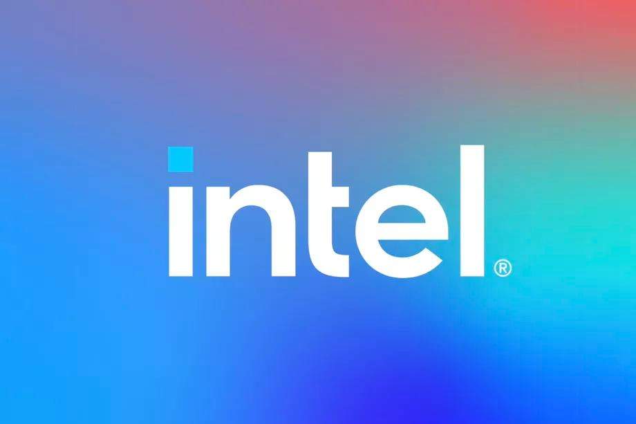
The global tech giant Intel has recently changed its logo after 14 years. It is obvious that the company is swimming with the recent tide of rebranding by global corporations. The world is fast adapting to a more slick, clean-cut branding strategy. Companies across the world are rebranding their logo, and overall outlook to become more ‘simplistic’. The days of critical designs, multiple colors, and unique illustrations are almost gone. In Intel’s case, its ever-popular swirl design has gone out-of-date, according to many experts.
Read more: Energypac & Padma Oil Expanding the LPG Distribution
THE EVOLUTION OF INTEL LOGOS
This is only the third time that Intel has changed their logo. At the time of their inception, the company had its original minimal Intel Typography. For a logo of that era, it was an outstanding initiation. It had a single-color coating, with the letter ‘e’ portrayed as a subscription. The original logo served as the spearhead of the company for 38 years, until its second change in 2006.
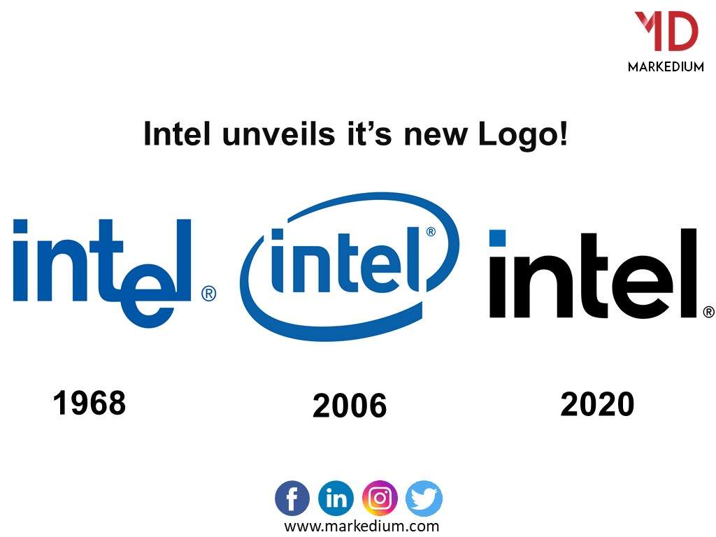
For millennials, the second logo is the most popular one. Every time any of us bought a laptop, we could see the ever-known swirl logo sticker. In their recent logo modification, Intel decided to go a little ‘simpler’. In the current world of branding, simple is classy. The company is now going for multiple variations of blue as a background with a white typeface. The little dot over the letter “I” of Intel has a blur coating. This represents processors, most remarkably Intel’s 11th Gen Tiger Lake processor.
On the other hand, Intel has also introduced a similar product typeface called ‘Intel One’. The typeface is displayed in the company’s latest product lineup. A simple, yet the classy representation of Intel’s value proposition.
What are your thoughts on the latest Intel logo?
[newsletter-pack newsletter=”5159″ style=”default” si_style=”default” show_title=”0″ heading_style=”default”][/newsletter-pack]














Leave a comment