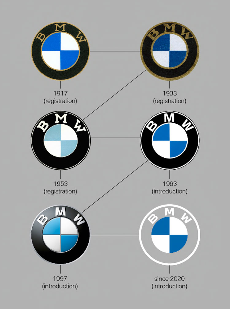
The global luxury automobile giant has changed its iconic new logo to align with the modern age of minimalism. This has been the most significant branding change for BMW after 23 long years when BMW adopted its previous iconic logo. But let’s be honest, we believe BMW made a childish attempt in designing the new logo.
So, what are the major changes?
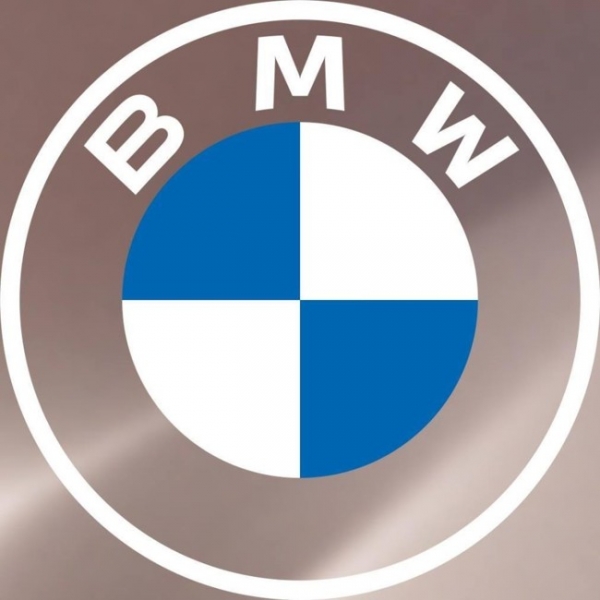
BMW has adopted a simpler main central icon removing its earlier 3D effect to adopt the essence of the modern-day minimalistic trend that resembles the early BMW logo in 1963. Well, we can appreciate the thought behind the concept. Secondly, the dark black outer circle of 1997 has been shifted to a transparent background.

The last change is something that we couldn’t accept. The plain transparent background is not only making the logo looks straight pathetic, but also it makes the logo hard to notice.
Read More: BMW says coronavirus hit China sales but sticks to 2020 global target.
Well, many might argue on the logo looking gorgeous on a dark-colored vehicle from BMW, but what about a white one? The logo will simply be almost invisible in any whitish substance. Or, any official paper which is generally somewhere near the plain white color.
Read More: Coca Cola to Invest $200million More In Bangladesh
According to Jens Thiemer, senior vice president of customer and brand, BMW-
“The logo was designed to radiate more openness and clarity!”
But in reality, the outcome of the new logo is far away from clarity. Why?
Two most important reasons are:
- Most of our digital screen carries a white or whitish background which makes anything pretty much easier and eye-soothing to read for any user.
- Secondly and the deadliest one is that it surely takes away the lucrative visibility of the BMW logo from a distance which has been one of the essences of the true brand value of BMW among its customers.
Hence, without any doubt, the new logo might look quite good in a dark-themed vehicle [Ex: BMW’s bronze-hued electric i4 sedan concept] or any dark substance, but as a whole- for us, the new logo seems like nothing but a result of the sloppiness or lack of visions from the creative division.
Having said all these, don’t forget to let us know your thoughts on the new logo of BMW. We are also hopeful that just like some of the previous examples, BMW will surprise with a turnaround with its new logo as well.
For more updates, be with Markedium.


Leave a comment