In recent times, the world as we know it is going through exponential changes. Businesses are shifting online. Brands are trying to capture and retain the market in diverse ways. In the current fast-paced market, brands are continuously re-inventing themselves. Be it with changes in operational structure, or simply the brand outlook. Many brands; both national and global have adopted a more simplistic method. Banglalink, one of the fastest-growing telecommunications services in the country, is no different. In their recent rebranding strategy, has changed its popular 3D logo into a much simpler and ‘modern’ emblem.
Read more: Bata Falls Into Losses After 58 Years In Bangladesh
Let’s have a look at the New Logo
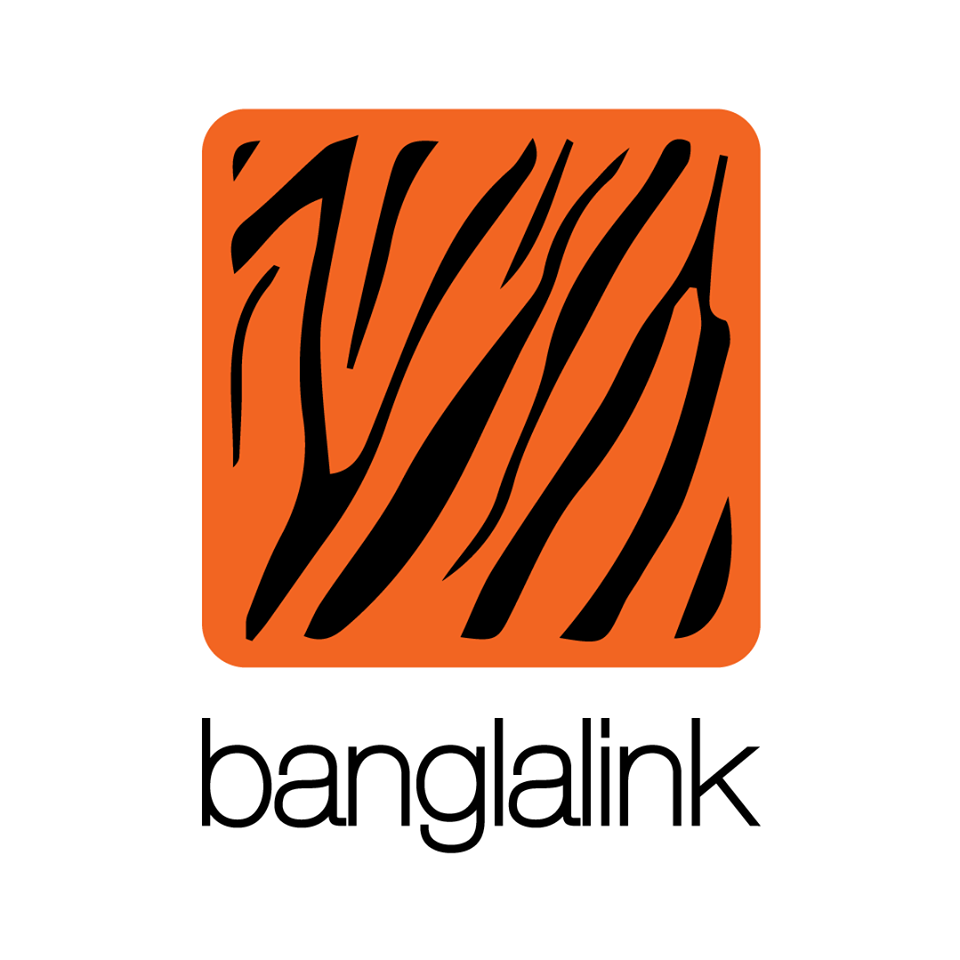
Banglalink has always prided itself as the fastest network available in the country. They are correct in their own rights. As the telecom giant has maintained this reputation for years now. The brand has positioned itself as the telecom brand choice of the common niche. With their marketing strategies focused mostly on the sub-urban and rural segments, the brand has grabbed a huge segment of the market.
In the second quarter (Q2) of 2019, the company saw a massive rise in percentage revenue with a 5.4% increase than the previous quarter. The company has adopted data-driven strategies in recent years with an aim to become the biggest digital player in the market.
With an attempt to re-invent their brand outlook, Banglalink changed its prominent 3D orange template with the bold white outline. Instead, they have adopted a much simpler design, with a ‘Helvetica’ font. The popular orange canvas has shifted from its white bolded outline, and the dark sketching on the canvas is now asymmetric. Banglalink tried to portray a rawer and more relatable brand outlook to their audience.
Many have taken a liking to the new logo unveiling. Many have voiced their opinions against it. But one thing is for sure, the new logo surely has people talking about it.
Let us know what you think of Banglalink’s simplified adaptation of their logo.
[newsletter-pack newsletter=”5159″ style=”default” si_style=”default” show_title=”0″ heading_style=”default”][/newsletter-pack]
















Leave a comment