In the world of advertising, capturing consumers’ attention is a constant battle. Brands are constantly seeking innovative ways to stand out amidst the noise and leave a lasting impression. One such approach that has gained significant traction is negative space content creation – a visually intriguing technique that embraces the power of empty spaces to convey powerful messages. And when it comes to mastering this art, Coca-Cola stands out as a pioneer and expert.
Read more: The Growing Ceramics Industry Landscape Of Bangladesh
Coca-Cola, the global beverage giant, has always been at the forefront of creative advertising. With its iconic red and white branding, the company has consistently pushed boundaries and revolutionized the way brands connect with their audience. But it is in the realm of negative space content creation that Coca-Cola has truly showcased its artistic prowess.
What exactly is negative space content creation?
It refers to the strategic use of empty or white spaces in an image or design to evoke emotions, tell stories, and create a memorable impact. By skillfully utilizing these voids, brands can communicate powerful messages, stimulate curiosity, and leave a lasting impression on viewers.
Coca-Cola’s innovative use of negative space in its advertising campaigns has captivated audiences worldwide. By incorporating clever visual tricks and minimalist designs, the brand has managed to create an immediate visual impact that resonates with consumers.
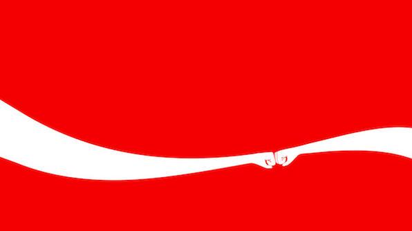
One of Coca-Cola’s most recent iconic examples of negative space content creation is its classic billboard without the shape of the bottle. In this 2020 OOH campaign from Coca-Cola, Publicis Italy uses nothing but the brand’s red and white logo and a small amount of copy to share the feel one gets with your hands around the bottle.
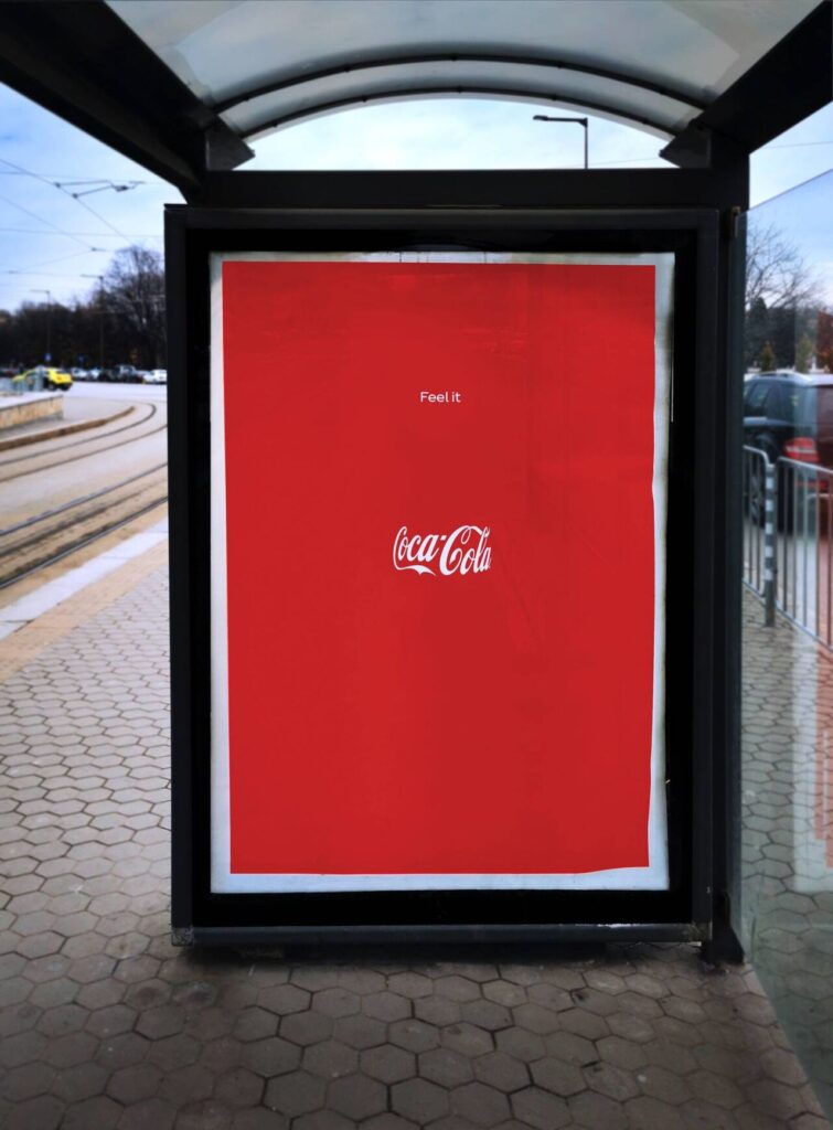
The design not only showcased the brand’s commitment to simplicity but also allowed consumers to connect the dots and visualize the product without explicitly showcasing it. This brilliant display of negative space utilization is a testament to Coca-Cola’s ability to engage viewers through subtle and artistic storytelling.
Here are a few brilliant examples of Negative Space Content Creation from Coca-Cola:


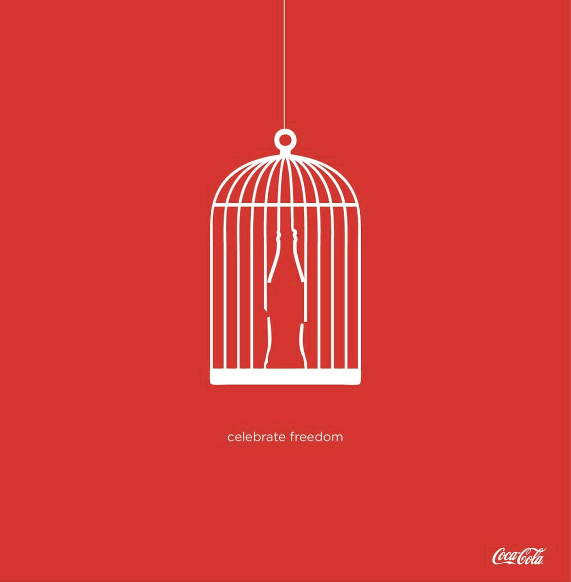
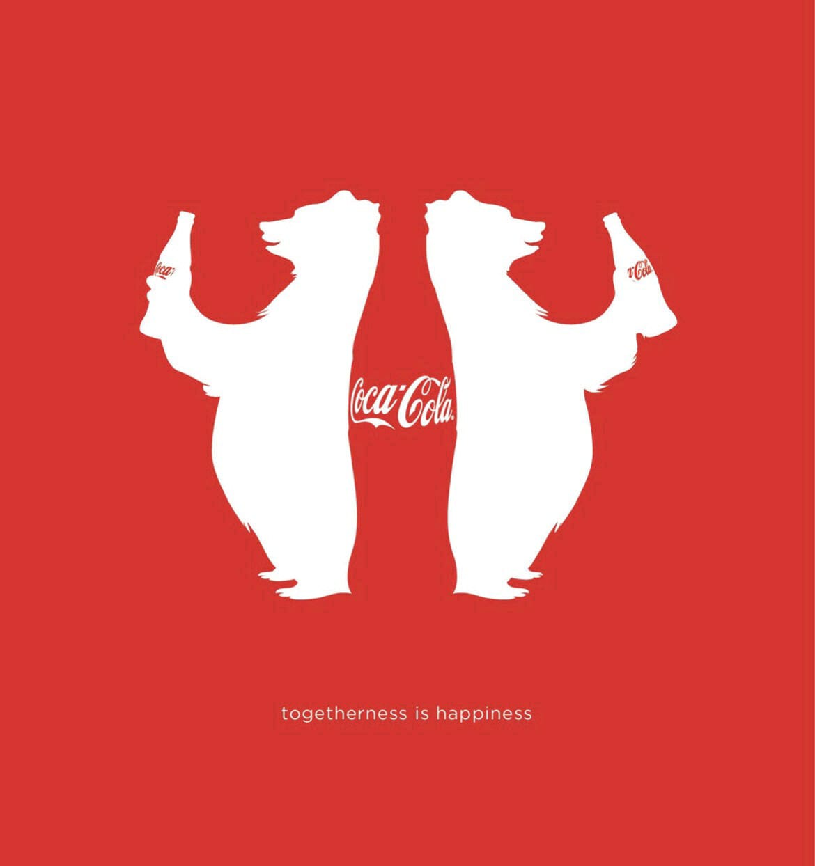
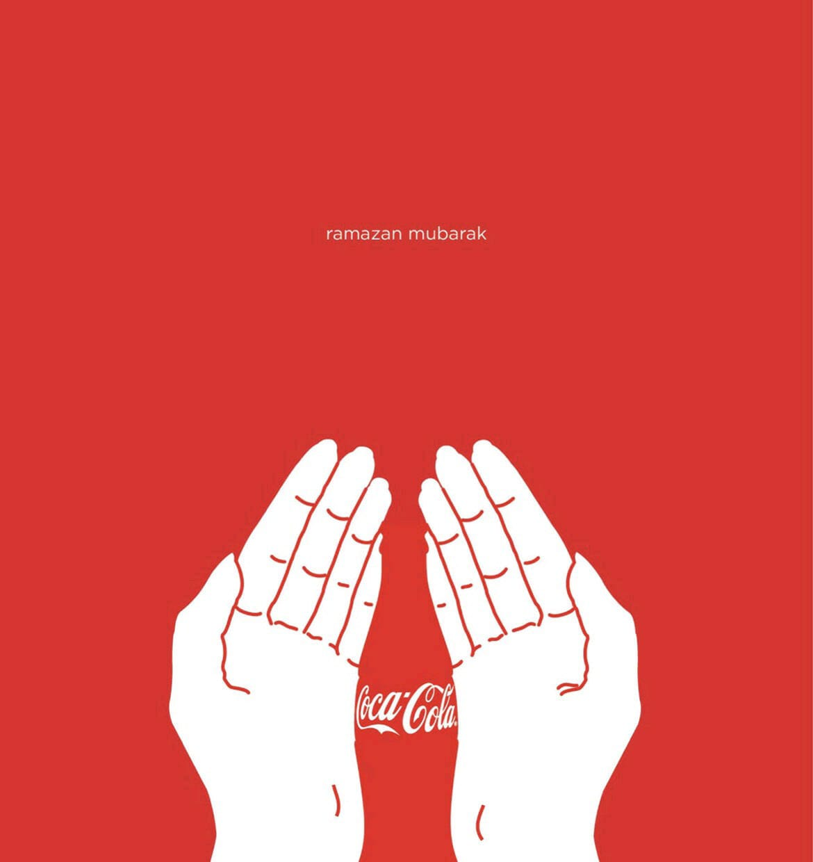

The success of Coca-Cola’s negative space content creation lies in its ability to strike a delicate balance between simplicity and impact. By embracing the power of “less is more,” the brand has mastered the art of using negative space to create a sense of intrigue, arouse curiosity, and generate buzz among consumers.
As other brands seek to make their mark in the advertising landscape, they can draw inspiration from Coca-Cola’s innovative approach. By leveraging negative space, they too can create visually intriguing and memorable campaigns that stand out from the crowd.
The art of negative space content creation exemplified by Coca-Cola serves as a reminder that sometimes, less is indeed more. By harnessing the power of empty spaces, brands can unleash the full potential of creativity, effectively communicating their messages and leaving a lasting impression on consumers.
So, as we continue to navigate the ever-evolving world of advertising, let Coca-Cola’s mastery of negative space content creation inspire us to push the boundaries of creativity, embrace simplicity, and captivate audiences in ways that transcend traditional marketing norms. Because in the realm of advertising, it is often the empty spaces that speak the loudest and leave the most indelible mark on our hearts and minds.
For more updates, be with Markedium.








Leave a comment