Microsoft Edge browser has got a new look. The tech giant has recently unveiled a very refreshing new logo for its upcoming chromium-based Microsoft Edge browser and thankfully it’s not like the age-old internet explorer.
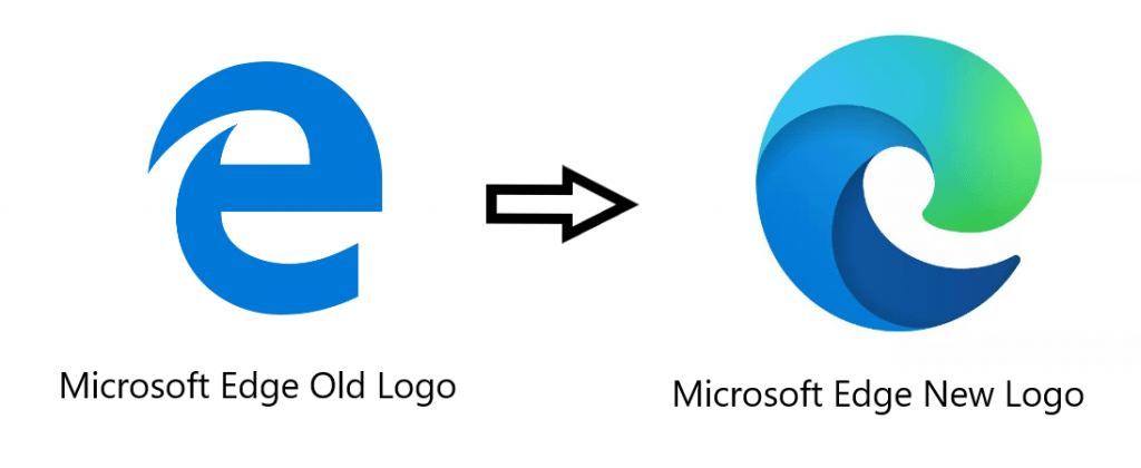
Microsoft initially represented the previous Edge icon four years back and it was almost look-alike to the internet explorer icon. Guess what? Microsoft Edge experienced a fair share of consumer perception connecting to Internet Explorer. And we all know what currently we all think about Internet Explorer. So, Microsoft was actually dealing with a severe problem to take space on the consumer mindset.

Now, let’s talk about the new EDGE icon!
There is a catch about this brand-new icon. The new logo was discovered as a part of a new surfing mini-game hidden inside the latest Canary versions of Edge. The new logo represents the letter E, but it looks more like a wave- an attempt to through away all the bitter essence of Internet Explorer.
Read more: Microsoft Beats Amazon | JEDI Deal.
Seems like Microsoft is successful in doing that. The new logo is much more refreshing than the previous look and it has a modern vibe. The design also complements Microsoft’s new Office icons.
But we believe the best thing about this new design is that maybe this time Edge can connect to the most exciting TG aka the Millennials. But that will be a huge rebranding game! At least it has got itself a chance to do so!
Now let’s wait for the final version of the new Microsoft Edge browser. Although the company has released a beta version to check the response back in August, the final date is yet to be announced. However, as Microsoft has unveiled the logo, we can assume that the day is not so far!
Don’t forget to let us know about your thoughts on this new logo of Microsoft Edge!


Leave a comment