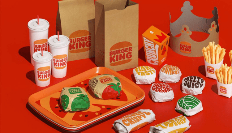
The home of Whopper- Burger King just got a new look after 20 long years. Burger King is welcoming 2021 with a vibrant new brand identity, conceptualized by Jones Knowles Ritchie. The new brand identity includes a new logo, packaging, restaurant merchandise, menu boards, uniforms, restaurant signage and decor, and social media, digital, and marketing assets.
Well, to be honest not exactly a brand-new look, yet the best it can be!
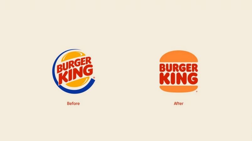
The new logo, which in fact, returns to an old logo first used in the late 60s. The one from the 60s logo depicts its wordmark in bubbly type between two buns, but the latest version delicately pinches the type, shape, and color. Basically, the new version feels fresh and the retro vibe makes it even more natural just like the whopper you want in your hand.
https://www.youtube.com/watch?v=pjT6hCNfthY
[bs-quote quote=”“We redesigned our logo intentionally inspired by our identities from 1969 to 1998, which were authentic, confident, simple, genuinely Burger King. So, we modernized a classic, making sure the new design was long-lasting, timeless. ”.” style=”style-19″ align=”right” author_name=”Raphael Abreu” author_job=”Restaurant brands international head of design at Burger king” author_avatar=”https://markedium.com/wp-content/uploads/2021/01/1528899461274-e1610154016913.jpg”][/bs-quote]
The declaration leads to a preference in digital-first expression and late upgrades to taste and food quality, through the expulsion of colors, flavors, and preservatives from fake sources from menu things, just as an aggressive promise to natural maintainability.
Burger king’s new brand identity has rethought each design component to more readily mirror the brand’s food journey while catching its one-of-a-kind characteristics: mouthwatering, large and intense, energetic, and gladly evident. The new moderate logo consistently meets the brand development of the occasions and gives proper respect to the brand legacy with a refined design that is certain, straightforward, and fun.
Let us know your thoughts on the latest rebranding from Burger King and for more latest updates, be with Markedium.
[newsletter-pack newsletter=”5159″ style=”default” si_style=”default” show_title=”0″ heading_style=”default”][/newsletter-pack]















Leave a comment