Reckitt Benckiser, the parent company of Dettol, Lysol, Clearasil, and Durex, announced that it’s rebranding as Reckitt replacing the previous “RB” visual identity. A refreshing new look.
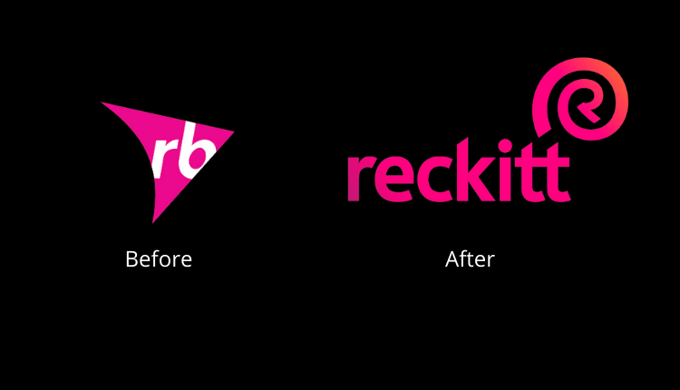
The new identity will be carried out across the entirety of Reckitt’s touchpoints and platforms – internal and external, physical and digital from Tuesday. This incorporates—a new name and logo, an advanced color range, and new typography.
https://www.youtube.com/watch?v=gwG5gNbk5aI
Read More: Reckitt Benckiser considers over $2 billion sale of Mead Johnson Greater China
“The brand is a visible symbol of our corporate purpose and the change that has been taking place across the business on our journey of transformation. The name reflects the existing widespread usage of Reckitt and is clearer, simpler and more memorable, while retaining positive associations with the company’s heritage.”
Miguel Veiga-Pestana HEAD OF CORPORATE AFFAIRS & CHIEF SUSTAINABILITY OFFICER
The comprehensive rebranding of Reckitt Benckiser, including a new visual identity, was created and overseen by Havas’ branding agency Conran Design Group.
https://www.youtube.com/watch?v=qsVVi5CM_Vo
Read More: Stories of Possibilities | bKash’s Latest Campaign Wants to Inspire Millions
The New Identity of Reckitt Benckiser comprises
- A new name and logo – the R at the heart of the symbol stands for our unity, strength, and relentless pursuit, inspired by Reckitt’s purpose to protect, heal and nurture. It denotes Reckitt’s role in the world as a partner and a catalyst for positive transformation. The shell-like quality of the symbol evokes a sense of protection and a reference to the natural world.
- An evolved color palette – the highly distinctive and recognizable ‘Energy Pink’ is Reckitt’s primary brand color, signifying its perpetual energy – while secondary colors reflect its portfolio of products and connection to a cleaner, healthier world.
- Bespoke typography – a new, bespoke typeface ‘Energy’ is distinctive, accessible, and unique to the Reckitt brand.
- Photography – new photography principles and categories illustrate how everything Reckitt does is connected and has an impact on the world. Authentic, accessible, and active imagery will show how change starts with an individual, the tangible impact Reckitt has on people’s lives, the strength of its partnerships, and its understanding of a changing world.
So, do you like the new refreshing look of Reckitt? Let us know and for more updates, be with Markedium.




















Leave a comment