Mastercard To Drop Its Name From The Official Logo2 min read
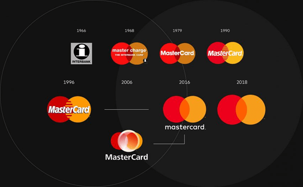
Big news from the Mastercard headquarter! The giant is about to remove the word Mastercard from the combine of interlocking red and yellow circles where it has dwelled for over 50 years. Just like Nike, Adidas, Apple and many more, Mastercard will be relying on their image of two circles standing alone in branding purposes.
Its reported that this is a rebranding stunt from Mastercard. The payment-financial giant now wants announce itself as a “Tech Company” in the global payment industry. With all the ongoing buzz surrounding the “AI and Blockchain” in the industry and the ever-changing nature of exchange currencies, the decision from the giant doesn’t seem of a bad one.
“A picture communicates better than words,” reportedly said Allen Adamson, co-founder of the marketing strategy firm Metaforce. “And they have the distinct advantage of having one of the most recognizable icons in the world.”
Well, alike in every other case, this step from Mastercard to rebrand itself has its own skepticism. But it has been reported in the Mastercard official press release that 80 percent of the users recognize the brand symbol without the name on it.

Now, there might be a lot of questions about the future of this bold step taken by the company. Although through this, Mastercard joins the elite class of brands like Apple and Nike but anything can happen.
As we all know, consumer behavior can be a very funny thing. Either ways, only time will tell. Let us know what do you think about your thoughts!


